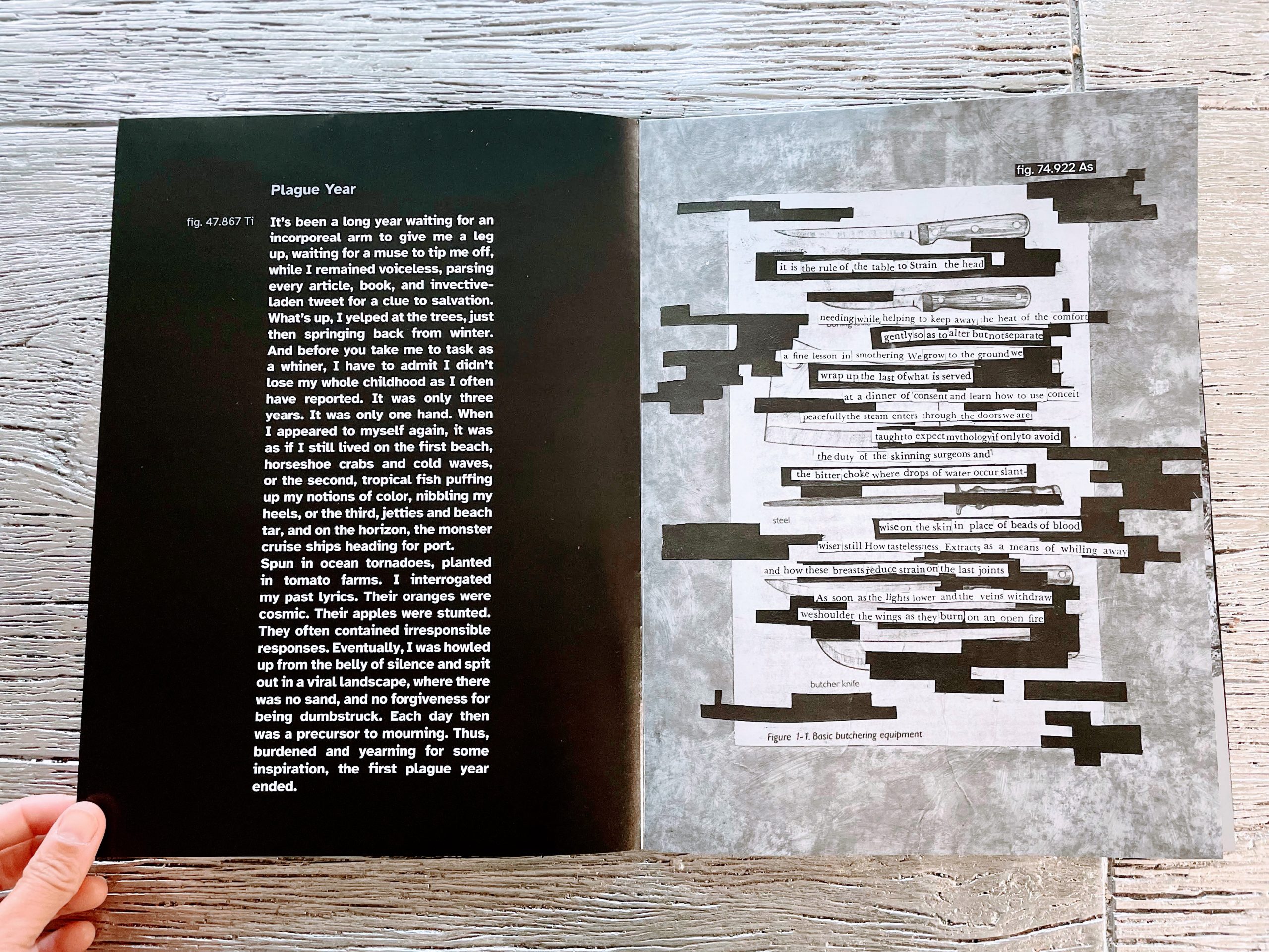
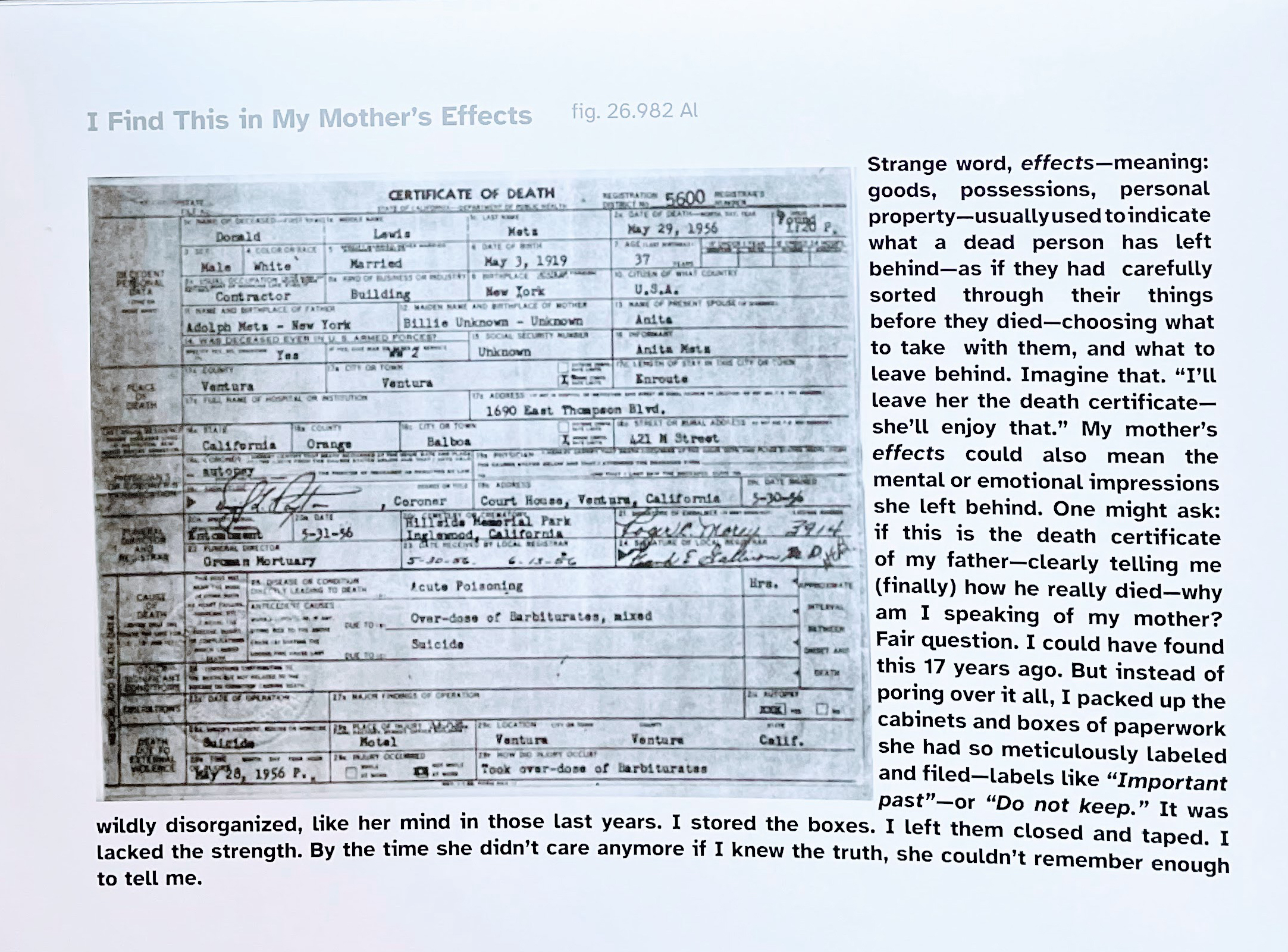
Tab Journal has published several visual poems over the last two years. Perhaps because we use design thinking in our approach to poetry, we’re interested in the definitions, practices, and possibilities for poets who are consciously using visual elements to create meaning. Tab Communications Coordinator Lydia Pejovic talked with five visual poets for the March issue: Maria DeGuzmán, Kylie Gellatly, Monica Ong, Donna Spruijt-Metz, and Keith S. Wilson.
Here, in excerpts from a longer exchange, she talks in further detail with Maria DeGuzmán.
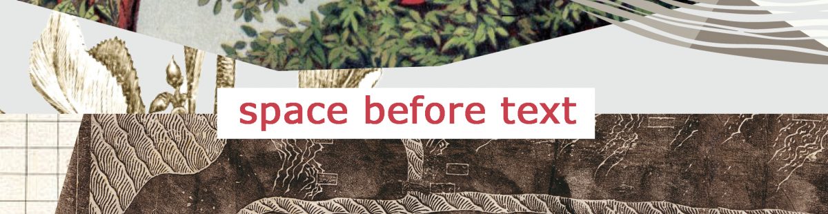
Lydia Pejovic: In Volume 10, Issue 2 (our Current Issue as this post goes live), your visual poetry functions somewhat like captions for photographs of what seem to be abstract images. How did you come up with this combination and decide the relationship between text and image?
Maria DeGuzmán: I see what you call photographs of abstract images as both abstract and subtly figurative, as formlessness taking form, and form reshaping into other forms. For me, captions to photographic images (whether figural, abstract, or both) were and are inspired by many sources: Egyptian hieroglyphs, medieval illuminated manuscripts, emblem books, children’s picture books, film (especially silent films), newspapers, comics, advertising, Surrealist experiments with word and image, album covers, book covers, video, etc. In most cases the caption attempts to anchor the polysemy of the mute image. But, the mute image continues to radiate, or vibrate, (r)evolving possibilities, slipping around and away from that attempted anchoring, as does the caption itself, despite its putative function.
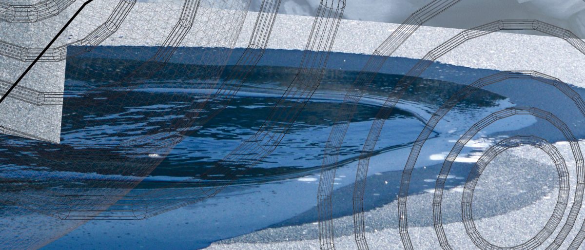
Either way, one is faced with a melting, deliquescence, or dissolution of the seemingly fixed and “solid,” even when one is working with figural, concrete images. These dynamics of signification are born out of the tensions between language and consciousness. Much of poetry would seem to spring from the attempt to go beyond the constraints of language. These tensions between language and consciousness drew me and continue to draw me to water. Why not work with liquidity, with water, one of the most seemingly familiar, yet strangest, of liquids, a compound substance with anomalous properties, evoking not only contemplation, but forms in motion, among them, animate things, life itself as we know it (and don’t know it) on this planet?
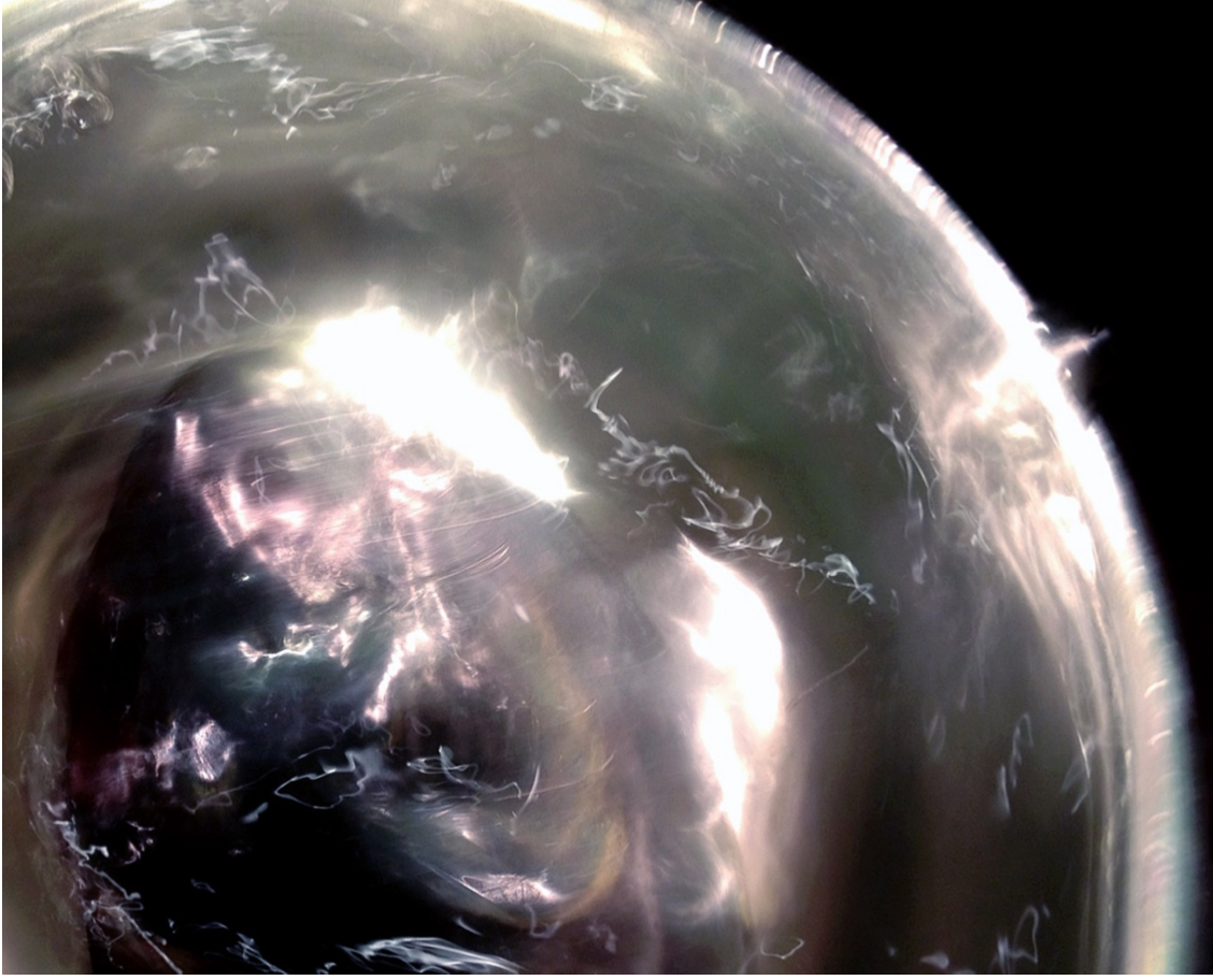
Captions are, in “Trauerspiel of Water,” captions for photographs of water being swirled around a bowl. The combination of captions and photographs of swirling water creates a juxtaposition between what, at first glance, might seem like the fixed (the caption) and the unfixed (the water), between intentional order and random chaos. However, the contrasting juxtaposition morphs into a surprising conjunction as the watery image assumes form (rather than formlessness) and challenges the assumed prerogative of written or spoken language to have dominion over form-making.
Lydia Pejovic: Do you spend a long time interpreting what you see in your photographs/images, or do you write based off of first impressions?
Maria DeGuzmán: I write from a combination of first impressions and time spent interpreting and researching what I see in the photographs. The first impressions come to me from the emotional impact of the image or images in question. These first impressions surge, a fragment of melody, not in words, but in tones and vibrations. I have a synesthetic response to them. The time spent interpreting and researching comes about through my interaction with the details of the images, details that correlate with striking forms and, furthermore, resemblance (in the midst of formlessness) to bodies (human and more than human), objects, land, oceans, maps, scenes, faces, squiggles of light that appear, to me, like numbers, letters (from a variety of alphabets), symbols, characters from shorthand, and so forth.
Lydia Pejovic: How do you go about creating your images? How do you choose the color, how much to swirl the water, etc.? Do the images often turn out differently than you expected them to?
Maria DeGuzmán: I fill a metal bowl with water. I then place this vessel on a counter or table near a window or a light source (sun, full moon, candle, sometimes an incandescent or fluorescent light). With my left hand, I stir the water in the bowl with a metal spoon. With my right hand, I hold a small, digital camera. I take photos while I stir, varying the angle of the shots.
Later, I examine the photos one by one to see what shapes the water has assumed, what shapes “appear” in the water. I do not choose the color or, a prioiri or consciously, how much to swirl the water. The colors come from the fact that the water acts as a molten, shape-shifting prism that bends or refracts light into its constituent wavelengths. The luminosity and the variegated hues derive from the interaction between light waves and the swirling waves of water in a metal bowl.
This experiment and/or ritual is designed to override conscious control and expectations. The images are not manipulated. They are the product of “straight photography” that yields queer results. The images result from the camera’s freezing of refractive and reflective patterns in the water swirling too quickly for the naked eye to grasp. However, what is “there” involves continual acts of interpretive perception, vision, on the part of viewers, myself included.
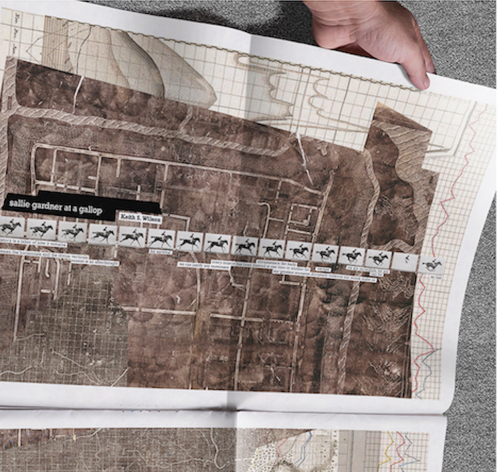
Previously in Visual Poetry: Keith S. Wilson
Next Up in Visual Poetry: Donna Spruijt-Metz