February is Low Vision Awareness Month. It’s a good time for Tab Journal to share our efforts over the last three years to welcome readers with low vision to the poetry we publish. Here’s an update, an overview, a trajectory–from Creative Director Claudine Jaenichen and Editor Anna Leahy.
Tab Journal‘s Vision of Low Vision
Because design has always been enormously important to how we approach poetry, Tab Journal isn’t like other literary journals. We consider ourselves designers and curators. When we say, “space before text,” we mean that design thinking extends both to textual content and to the space the work creates. We understand that form, format, and design of text and space can create various reading experiences. As part of our design thinking, Tab Journal is committed to creating an increasingly inclusive literary space, welcoming work that represents a variety of approaches and aesthetics, including work from those whose voices have been traditionally underrepresented in literary publishing.
Why consider low vision?
If you have high vision, it’s important to keep in mind that millions of Americans don’t. Many of us use assistive devices like contact lenses or glasses, but those devices don’t work equally as well for everyone. Take a look at versions of what those with age-related macular degeneration or cataracts see, and consider what these videos suggest about the various ways people see the world.
What does this have to do with poetry?
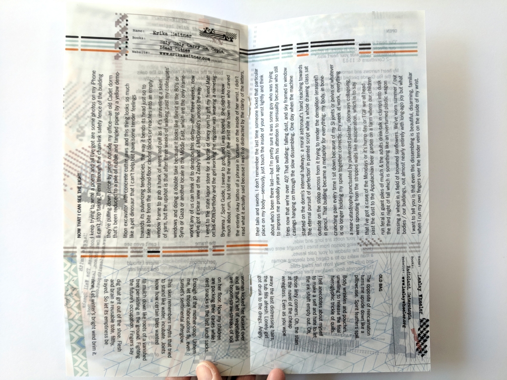
Tab Journal‘s January 2019 issue was printed on velum that allowed content from other pages to seep through. This meant that reading a page was filled with external visual noise that the reader had to negotiate. We designed an intentionally challenging reading experience in which ease couldn’t be taken for granted. Moreover, the type size was only 8 points. That’s small but not unusual for books and magazines (though visual size is more accurately measured as x-height).
As we reflect on our literary journal’s history and process, we look to this visually noisy issue as a pivotal moment. We realized that we had excluded readers who can, or would, engage with the poems.
At the same time, we were switching from the clunky Open Journals System platform to the current WordPress-based platform. We realized that our online issues—the PDF files of our archives—were impossible for e-readers to follow.
Access in the form of readability matters, perhaps especially in poetry. Because each word of a poem matters, readability is important.
What changed?
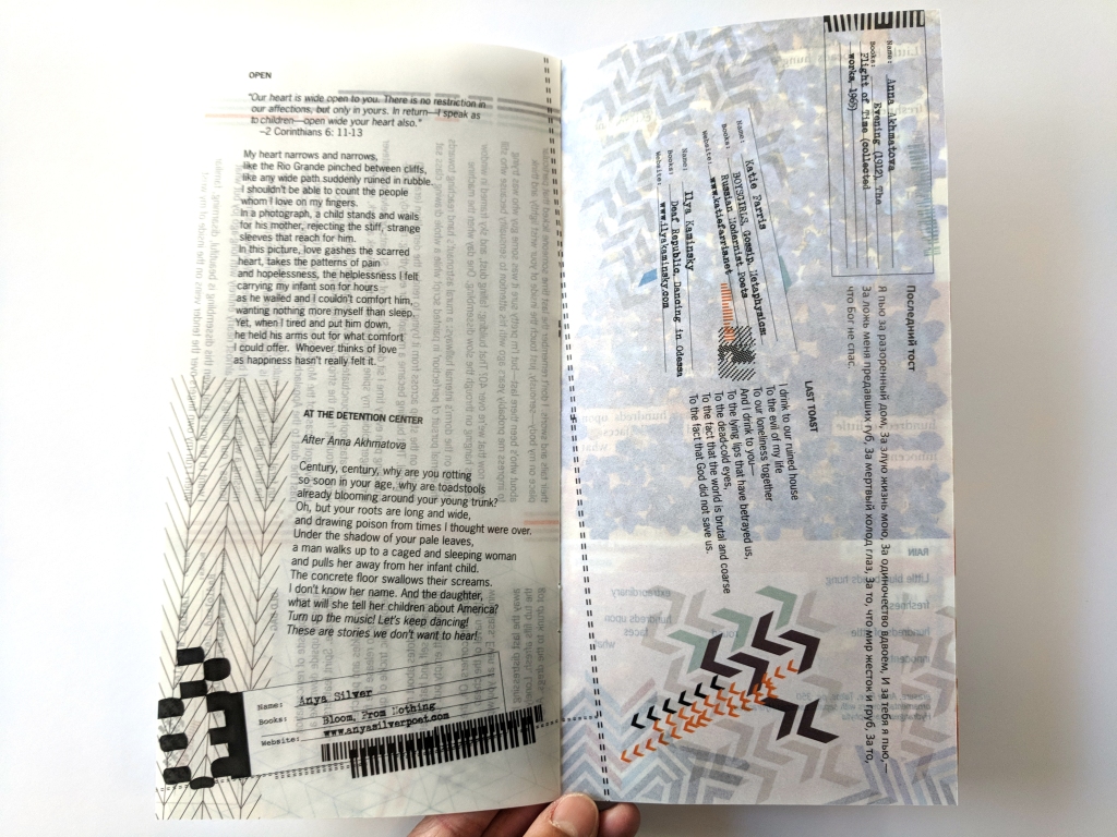
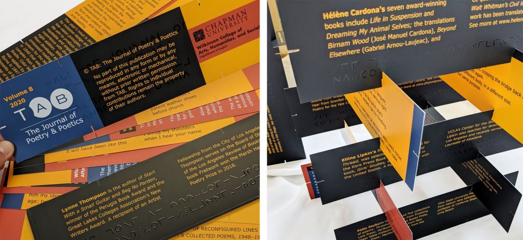
Beginning with our print issue in 2020, Tab Journal shifted the visual experience and design to prioritize low vision standards. Low vision standards for graphic design include clear headlines, color to ensure enough contrast and color pairing to accommodate people with color blindness, typographic legibility and readability, and printing surfaces that minimize glare.
Tab Journal now uses a standard type size range between 13 and 18 points in the annual printed issues and considers the fonts and weights (e.g. bold, medium, regular) can be applied for optimum legibility. Typefaces that are too wide or too narrow (such as condensed fonts) impede legibility. In the 2022 issue, we used Atkinson Hyperlegible font designed by Linus Boman with the Braille Institute. You can download the font for free at https://brailleinstitute.org/staging2/freefont.
Tab Journal is also minimizing the use of all capital letters. Using all caps can sometimes be read as individual letters by assistive technology instead of as words. That’s why we now use Tab Journal as much as possible instead of the official name (TAB: The Journal of Poetry & Poetics) under which the journal’s ISBN is registered. We continue to consider the research on reading ease and speed as well as options for using all caps or other visual signals, knowing that WordPress.org defaults are also part of our constraints.
Readability is also based on line lengths and column width. In poetry, column widths and the line lengths are determined by the poem, and we make sure that typographic attributes represent the poem in the most legible format.
What does this mean?
We offer two issues below of examples that demonstrate both an inaccessible format (2019) and low vision complaint issue (2020).
What’s next?
As part of our effort to ensure an equitable experience of our journal for everyone, we are developing more training in 508-compliance to meet a wider range of adaptive and assistive technologies. Section 508 was signed into law as part of the Rehabilitation Act Amendments of 1998 to ensure that access to electronic and information technology is created and accessible to people with disabilities.
This year, we have applied for external funding to further our efforts in low vision accessibility and other ways we can increase equity and inclusion overall in literary journal production. We recognize the need for the literary culture to account for accessibility when we consider resource allocation.