
Because design is enormously important to how we approach poetry, Tab Journal isn’t like other literary journals. We consider ourselves designers and curators. When we say, “space before text,” we mean that design thinking extends both to textual content and to the space the work inhabits and creates. We understand that form, format, and design of text and space can create various reading experiences. As a unique print issue each January and online issues the rest of the year, we experiment with design, materiality, and the reading experience as print and electronic forms negotiate coexistence.
Part of this design thinking is a commitment to creating an increasingly inclusive literary space and welcoming work that represents a variety of approaches and aesthetics, including work from those whose voices have been traditionally underrepresented in literary publishing. Volume 8 (2020) was a turning point for Tab Journal, as we developed low-vision standards, switched to an online platform and interface with greater accessibility, and adopted Submittable. You can read more about our low-vision standards from Creative Director Claudine Jaenichen at Tab Musings. With a grant from the Poetry Foundation, Volume 10 (2022) included two BIPOC Consulting Editors in editorial decision-making. With a Scholarly/Creative Grant from Chapman University, Volume 11 (2023) is informed by a consulting disabled designer.
We encourage you to spend some time with Tab Journal and consider the reading experience we’re creating. We hope you’ll appreciate how the project evolves with each new volume. We’ve included here a design statement for each volume, beginning in 2013.
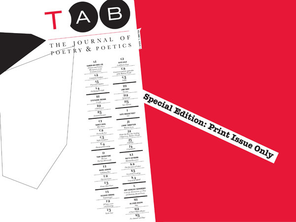
Vol. 1 (2013)
TAB: The Journal of Poetry & Poetics launched a new journal of original poems, poetry criticism and nonfiction, interviews, reviews, and other writings that reflect and shape contemporary poetry. Tab Journal‘s first issue appears as a black & white & red (read all over) tabloid, drawing from conventions of newspapers.
Online issues follow, using the Open Journal Systems platform designed for scholarly journals. The issues are created as downloadable PDF files. Viewable online, the dimensions and orientation are designed for the screen. The pages are oriented horizontally, and though they can be printed, their dimensions don’t match standard paper sizes. The design of online issues consciously uses white space, as the horizontal page welcomes the writer’s deeply embedded sense of the vertical page on which we usually compose and submit our work.
Each format allows for very different approaches to content and design, and Tab Journal works with each format on its own terms.
Vol. 2 (2014)
From the beginning of the 2014 January print issue, each page employs atmospheric and, at times, abstract photography of the sky taken at different times of the day. In addition, text has been placed within various objects specifically chosen to interact with light. These objects include water, glass, blinds, wrinkled paper, and windows. The sequence of time is reflected in the progression of the journal, beginning with morning light and moving to night.
The print issue’s spine is unorthodox, creating unexpected vertical and horizontal movement in the reading experience. The physicality of the object forces the reader to acknowledge its presence. The life of this interactivity becomes an individual journey of pages unwilling to be turned passively. The space in this issue challenges readers to take in more than merely text and image but also a full-body experience of holding and of disorientation.
Each year, online issues pick up on design elements in the print issue.
Vol. 3 (2015)
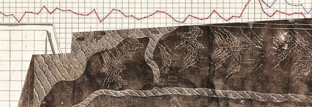
The 2015 January issue explores mapping as place, location, and orientation. The print issue’s design this year encourages reading mindfulness with the intention of getting lost, disoriented, having to navigate a way through as someone might navigate a journey; it encourages discovery. The issue emphasizes the iconic physical ritual of unfolding and refolding maps and also the visual weight of traditional street maps in order to communicate credibility and an authoritative source of being an actual place. But this place—Tab Journal—is also no place.
In designing the print issue, we examined work by Jacques Bertin, a French cartographer and visual semiotician. In his book The Semiology of Graphics, he synthesized design principles with rules applied to writing and topography. His work was dedicated to the study of visual variables (shape, orientation, color, texture, volume, and scale) of maps and diagrams to code visual combinations that would create successful map-reading objectives. We challenge these guidelines by employing visual variables associated with illegibility, including graphic density and angular illegibility. The front side of the map, which contains the poems, tightly compresses layers between text and texture, eliminating hierarchy and contrast. There is no right side up so disorientation is part of the reading experience. This is further emphasized by an orientation conflict in which each poem is placed on its own angled baseline.
This backside of the map provides information about the authors. In order to discover the author of a poem, the reader must flip between the front and back of the map to determine its placement on the latitude and longitude grid. This side of the map uses photography of places so specific that the reader is excluded from knowing the place. With the common use of GPS and everyday devices that lead the way rather than show the way, this print issue empowers the reader to lead their own way.
Beginning in 2015, Tab Journal publishes the print issue in January and online issues in March, May, July, September, and November. For the first time, Tab Journal devotes an entire issue to poems by children; the May issue each year now includes winners and selected runners-up in the California Coastal Commission’s K-12 poetry contest. As always, the online issues play with the design established in the print issue.
Vol. 4 (2016)
The 2016 print issue explores the representation of energy. Energy is best conveyed by experience, in context, generating an emotional effect. Yet, we learn energy in two-dimensional, static visual representations like weather system reports, combinations of molecules, and diagrams like the ones used to explain the energy forces of how the Twin Towers collapsed during 9/11.
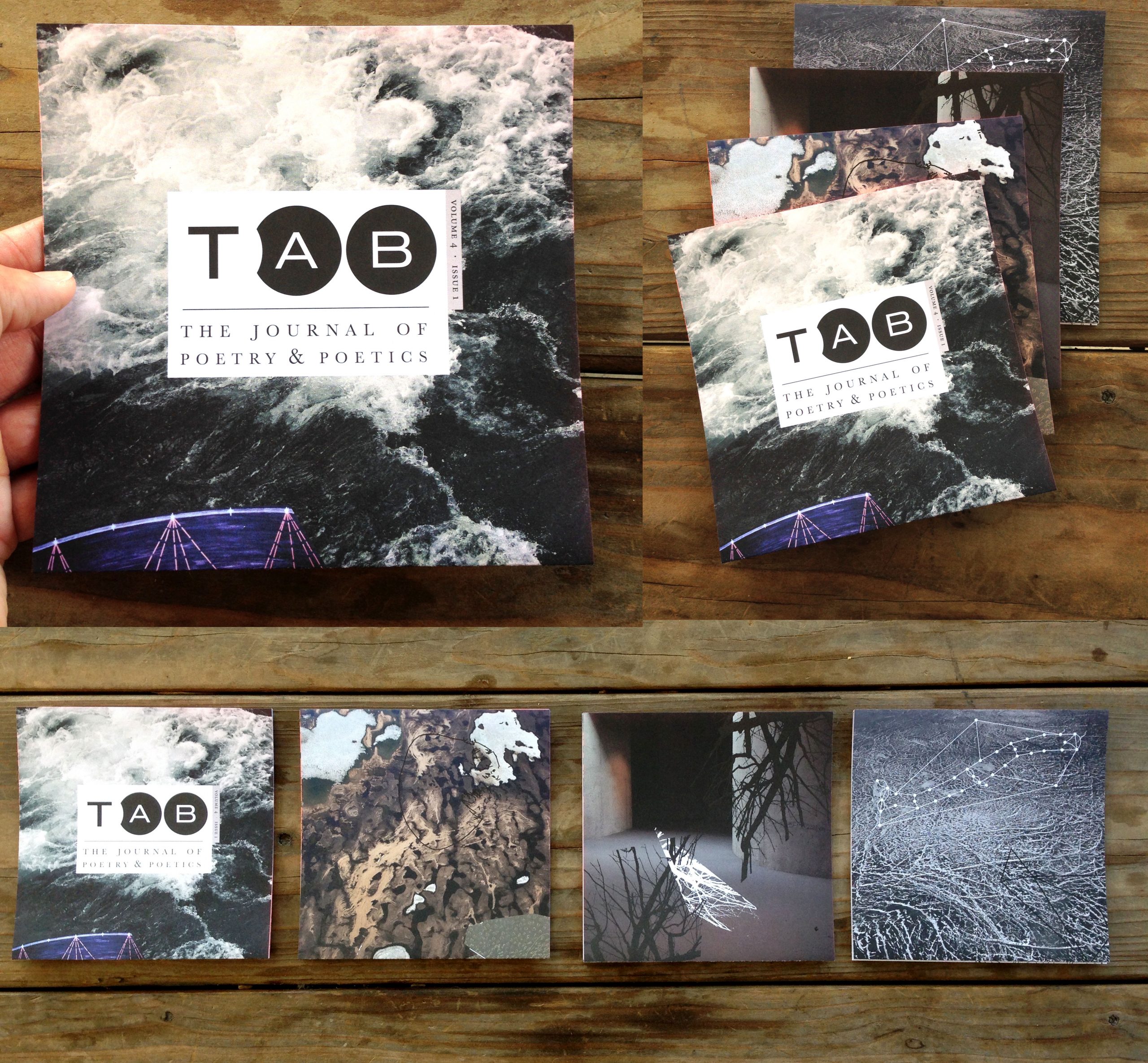
This issue contains four energy panels—movement, connection, destruction, sustaining—dedicated to the exploration and relationship among diagrammatic representations, the expression of energy, and poetry. Diagrams interact with text and visual compositions that occupy the space and create new visual representations of energy. The contrast and radiance of the back panels is a complete manipulation of diagrammatic language, returning movement, and chaos that leaves an emotional imprint to the experience of the viewer. Perforated panels empower the reader to redirect energies, recreate sequence, and construct narrative.
The print issues of Volumes 3 and 4 use the same size sheet of paper. The map issue of 2015 folded into a handy rectangle, whereas the energy issue of 2016 was cut into strips that folded accordion-style into squares. The same material starting point led to two very different end results. While the online issues look more consistent year to year, their design changes each year to draw from the print design.
Vol. 5 (2017)
Published in January, the 2017 print issue examines the effects of noise and text delivered to the reader as visual volumes on multifaceted layers. Textures and patterns act as a sounding board, adding a variety of tones intended to create an atmospheric pairing with the poems themselves.
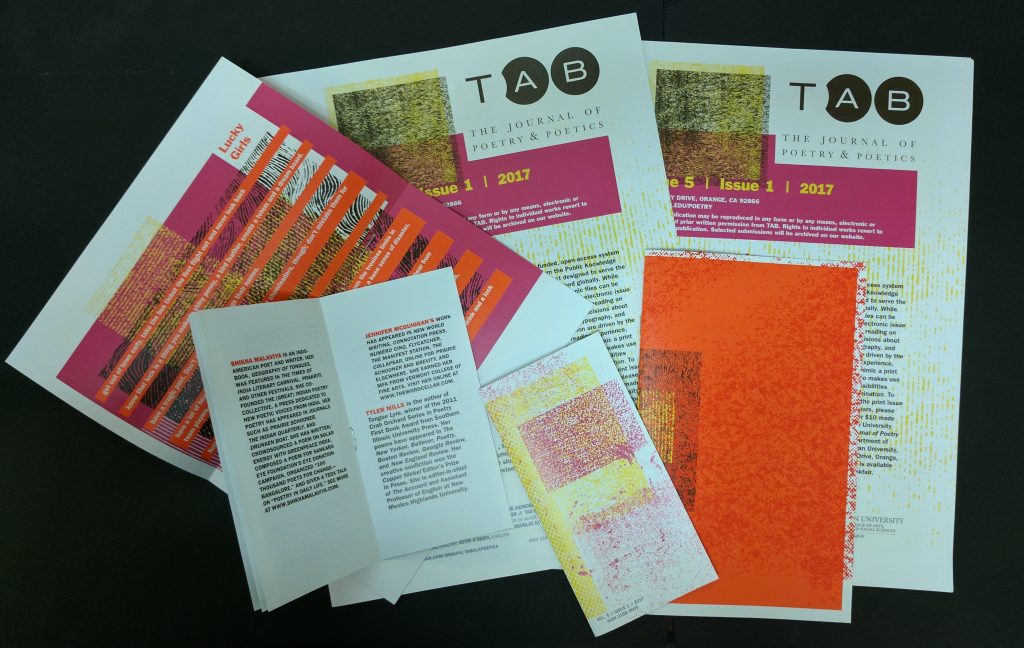
The 2017 print issue was composed of three differently sized, staple-bound parts, including a special feature of work by mentors and mentees in the Writer to Writer program hosted by the Association of Writers and Writing Programs. This issue was distributed widely free of charge at the AWP Conference, including at the 50th anniversary gala dinner.
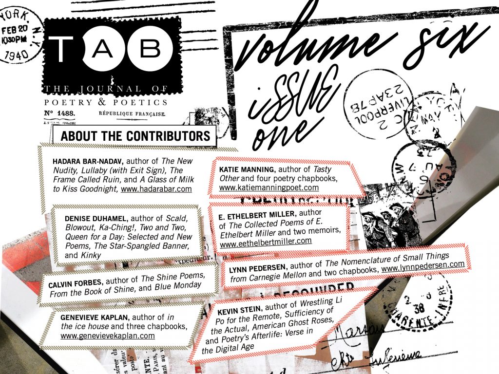
Vol. 6 (2018)
The 2018 print issue amplifies the qualities in aesthetics and materials of ephemera as the main framework to poetry. Damien Gautier contributes his photography of urban typography showcasing various words, letters, and signs that Tab Journal rearranged and layered, calling attention to the arbitrary size and two dimensions of both the physical photograph and the postcard.
In today’s world of excessive materials in a disposable culture, Tab Journal revisits the function and permanence in a collection of postcards. The issue arrives in a vacuum-sealed plastic sleeve, so that the issue’s cover(ing) must be destroyed to read its contents. We examine the origin and value of a postcard as a record of personal travel, propaganda, and advertisement and how some collections end up being documents of preservation.
Vol. 7 (2019)
The 2019 print issue of Tab Journal explores the concept of containment, both of a poem as container that delivers words to the reader’s eyes and ears and of paper and typography as containers. The visual language in this issue experiments with tags, labels, tracking methods, scanning, etc., upon which we rely for accurate delivery and that reveal the final experience contained within and across pages. The materials used in this issue play with transparency and hiding what is contained.
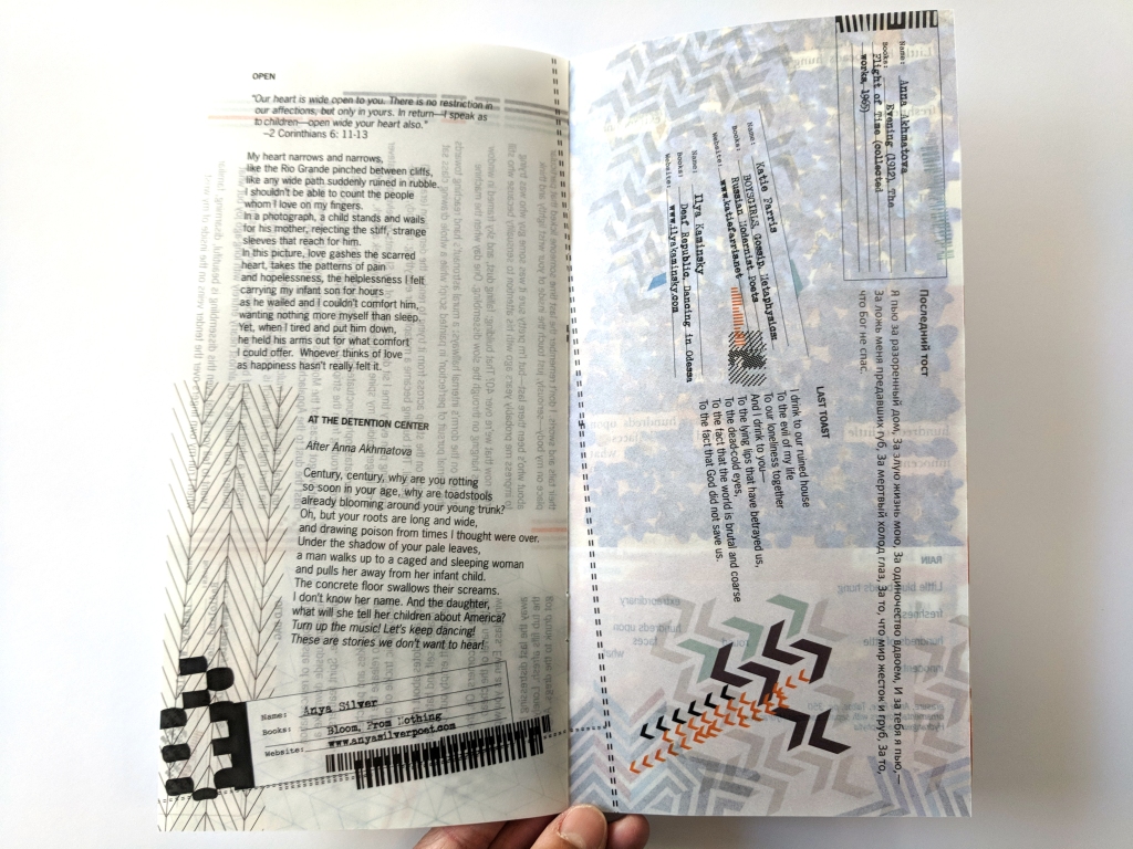
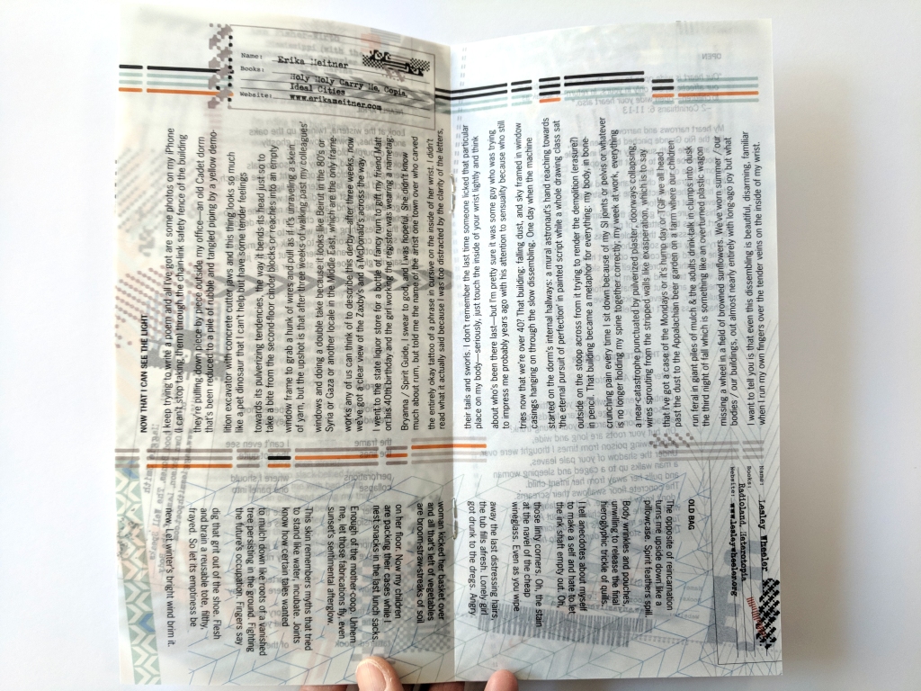
The January 2019 issue features original poetry by Ivy Alvarez, Ann Fisher-Wirth, Sonja Johanson, Vandana Khanna, Erika Meitner, Anya Silver, Maggie Smith, and Lesley Wheeler as well as a translation by Ilya Kaminsky and Katie Farris of a poem by Anna Akhmatova.
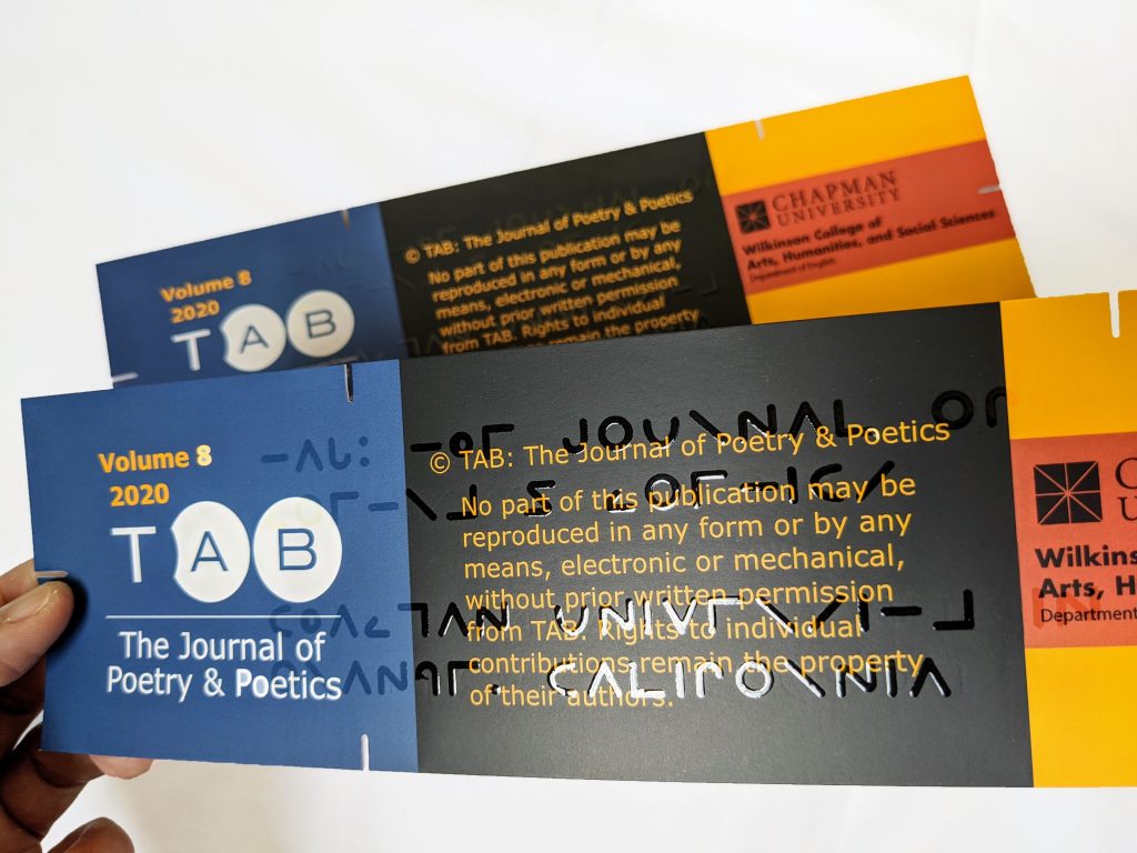
Vol. 8 (2020)
The 2020 print issue was driven by inclusive design and low-vision principles. You can read more about our low vision standards and the rationale behind them in the post at Tab Musings from February 2022. We aimed to produce an equitable and engaging experience with diverse sight abilities.
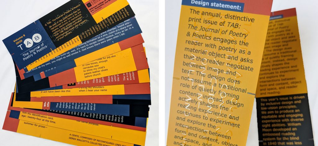
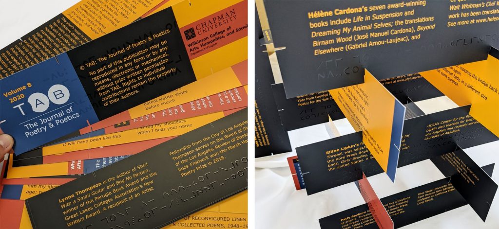
In 1840, William Moon developed an embossed reading system for the blind that was less complex than learning Braille. It was centered in Britain but later shared by missionaries in India, China, Egypt, Australia, and West Africa. It now appears in TAB‘s 2020 print issue. Among other elements, the authors’ names and website addresses are embossed on the pages.
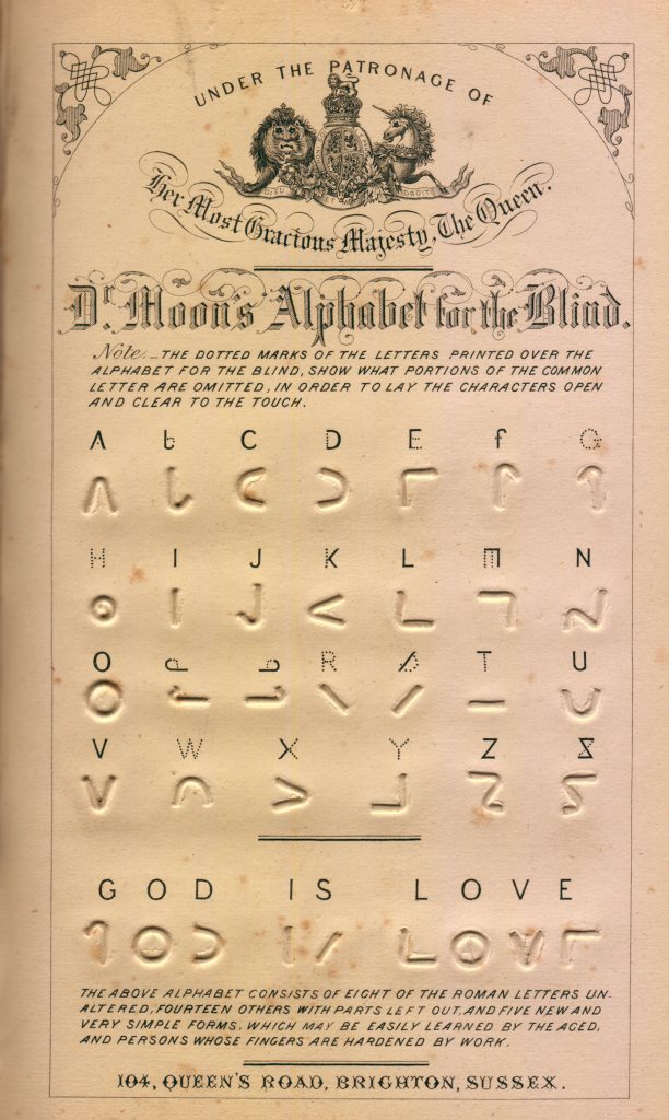
Although Moon’s system was more accessible and easier to implement universally in other countries, it was more expensive to print. Braille became the more recognized and used system by the late 19th century. Moon’s system is still used today by those who find the tactile sensitivity required of Braille to be challenging and to help children adapt to a tactile reading system before they learn Braille.
The Moon system was particularly useful for people who had lost their sight later in life because the Roman alphabet had already been deeply rooted in their cognitive recognition and recall and proved easier to learn than the abstract system of Braille. Moon’s system could be taught and learned in only a few days.
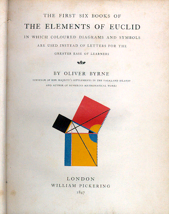
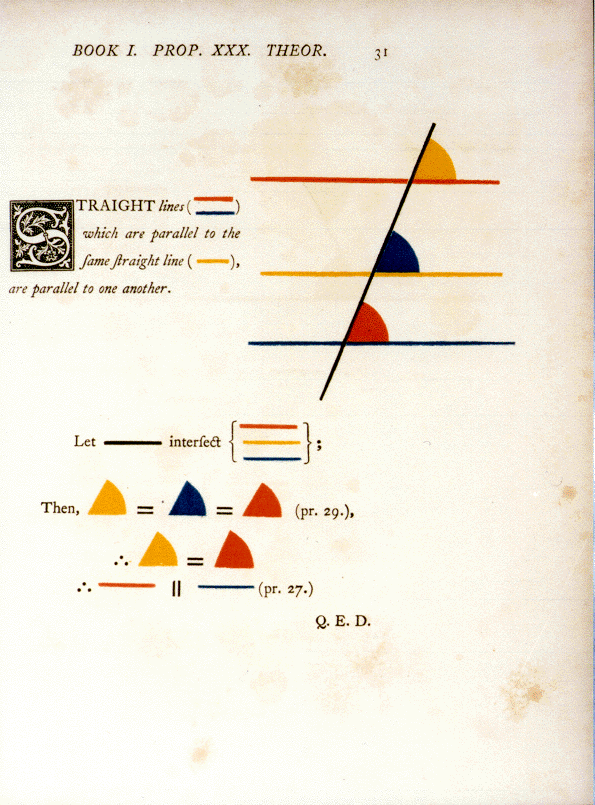
The color blocking used in this issue of Tab Journal echoes the approach that Oliver Byrne applied to The Elements of Euclid in 1847. Byrne translated all seven books of the Elements into a visually dominating presentation of diagrams and color to help categorize and highlight information. Byrne published mathematical and engineering works in the more text-based tradition, but with The Elements of Euclid, he made it clear by his subtitle, “…in which coloured diagrams and symbols are used instead of letters for the greater ease of learners,” that he intended the publication to be more accessible.
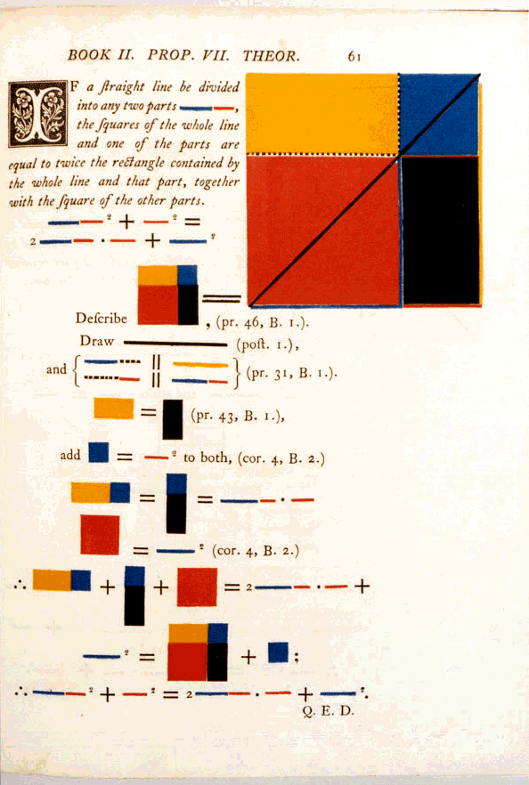
The first issue of Volume 8 used colors and geometric blocking similar to Byrne’s to help demarcate content and organize the reading experience. The design also used a matte finish and increased contrast for readers with varying contrast sensitivity.
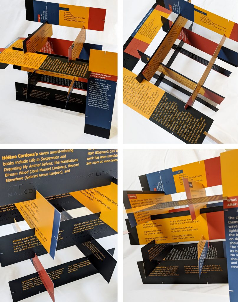
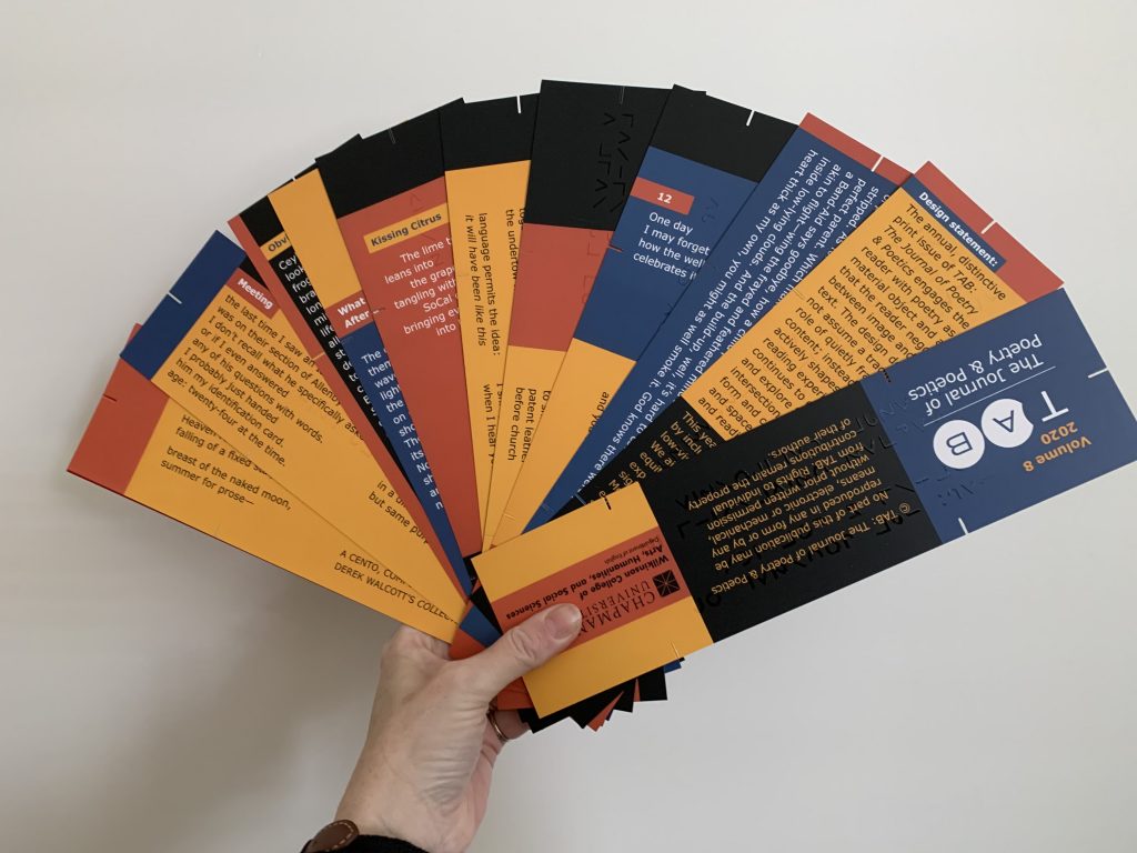
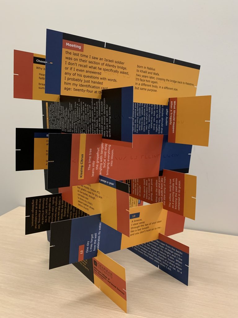
In addition to the visual elements, the pages of the 2020 print issue of Tab Journal were not pages so much as a set of twelve rectangular cards on which some poems appear vertically and others appear horizontally. While the stack arrived with poems ordered alphabetically by last name of the poets, the contents were not paginated and can be shuffled and read in any order.
Further, the cards were notched on all sides, which allows the reader to hook them together in various physical forms. It’s relatively straightforward to build a structure that reorients the poems. As with previous print-issue designs, this year’s encourages readers to be aware of reading as an experience.
Vol. 9 (2021)
This year’s print issue of Tab Journal was created during a time of quarantine as the world underwent the isolation and anxieties of the Covid-19 pandemic. During this time, we reflected on concepts of time—as a sense of place, as space, as structure, as the visual experience of light and dark. Time has an impact on psychology; we can lose time or lose track of time. Time has a history of visual representation and documentation as well. This year’s print issue explores visual expressions of time warping, time-traveling, and the chronology and the kaleidoscope of time-keeping. In this issue, the images and texts engage in ideas of process over time, such as healing or growth.
This issue of Tab Journal is printed on large-format newsprint, a once-dominant medium for distributing news. Now, this medium, with its ink rubbing off on the fingers, echoes another time altogether in the United States. Newsprint is strong, thin paper at a relatively low cost, with the option for the large-format page that supports our accessibility goals for low vision readers of our print issue. Because pages of newsprint are not bound, the pages of this issue of Tab Journal can be separated easily and hung as artwork. In addition, because of the large-format, thin paper, the cootie catcher poem at the end of the issue can be cut out, easily folded, and used to experiment with iterations of the poem without damaging other poems in the issue.
Vol. 10 (2022)
This 2022 volume is our tenth issue. It is no coincidence, then, that this issue echoes the durability and usefulness of aluminum and tin, the traditional tenth anniversary gifts. This volume, launched with a large-format print issue, quite literally reflects and shines and is our gift—from the staff and the contributors—to literary culture.
The design for this year’s Tab Journal emerges from a year of recognizing the complexities of choice, drawing boundaries, and acknowledging multidimensional anxieties of being between a rock and a hard place. As we continue to experience the compromises that go hand in hand with the pandemic, as we continue to face the relentless considerations of safe and dangerous spaces, this issue surveys concepts of shared corners and shelters, of physical and metaphorical places and spaces where individuals, pods, and communities take refuge.
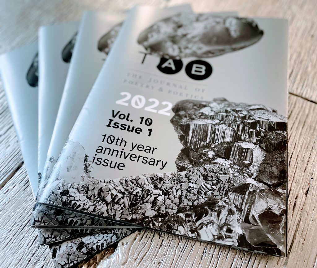
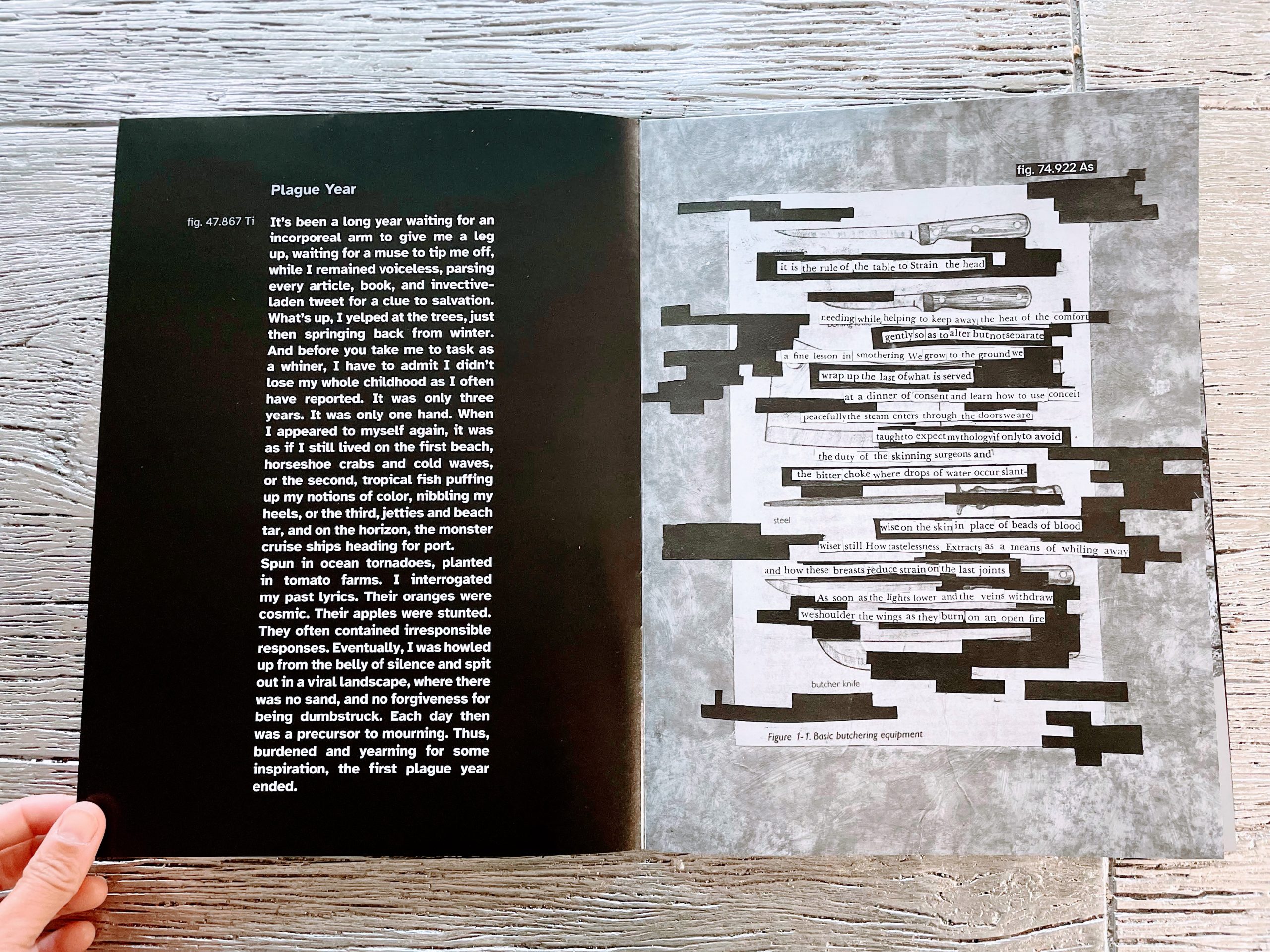
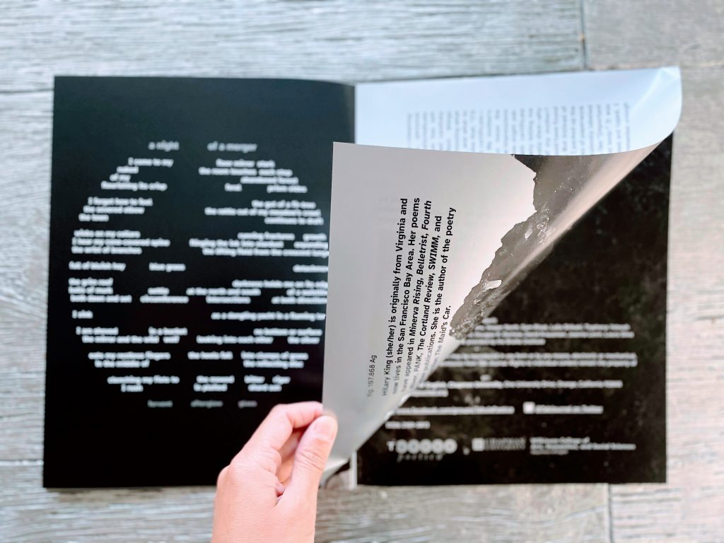
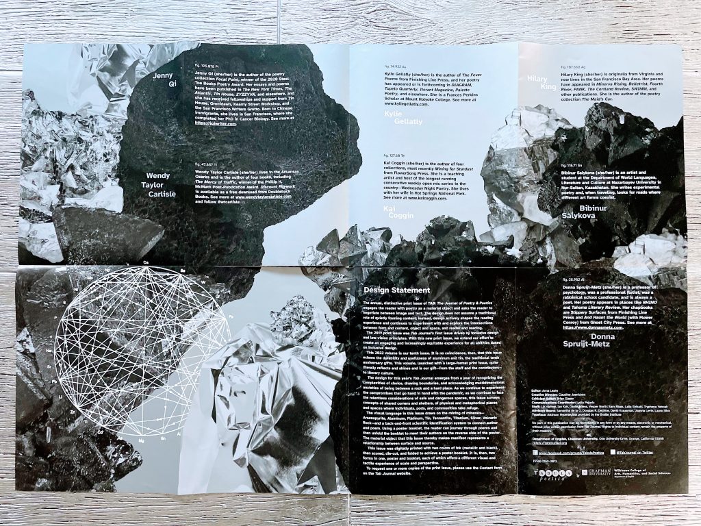
The visual language in this issue draws on the mining of minerals—Arsenopyrite, Aluminum, Platinum, Tin, Tennantite, Titanium, Silver, Volcanic Rock—and a back-and-front scientific identification system to connect author and poem. Using a poster booklet, the reader can journey through poems and then unfold the booklet to meet their authors on the reverse side of the poster. The material object that this issue thereby makes manifest represents a relationship between surface and source.
This issue was digitally printed with two colors of ink (metallic and black), then scored, die-cut, and folded to achieve a poster booklet. It is, then, two forms in one, poster and booklet, each of which offers a different visual and tactile experience of scale and perspective.
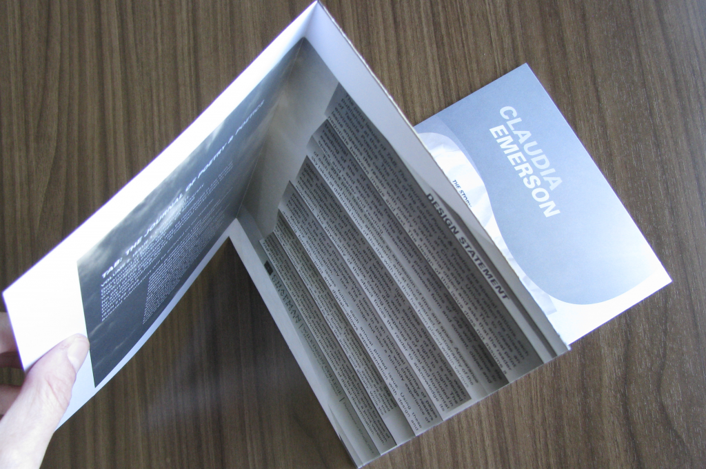
Vol. 11 (2023)
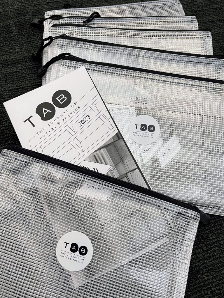
The 2023 volume is Tab Journal’s eleventh year, and its print issue draws from traditions of how reading materials are made available to readers. Certainly, text is contained in objects such as books, journals, newspapers—with their scale, weight, and page-turning demands. These objects take on their weight based on cover material, size of page, binding, and ink. A single volume of The Compact Oxford English Dictionary (2nd Edition) weighs 14.8 pounds and comes with its own magnifying glass.
And how are such objects themselves contained? The shelves where books and journals are stored are exclusive to people who can reach, grab, unstack, and navigate codex systems, all within the rooms and buildings that shelves—and readers—occupy. Henry Petroski writes in The Book on the Bookshelf, “Books and bookshelves are a technological system, each component of which influences how we view the other. Since we interact with books and bookshelves, we too become part of the system. This alters our view of it and its components and influences our very interaction with it.”
In Volume 11, Tab Journal questions access in relation to interaction and portability. With digital and audio formats of reading material, what is the place for print? Tab Journal strives for flexibility in a physical interaction yet defies the traditional anatomy of a codex—a spine, page signatures, and an obvious cover. It is not waiting to be chosen from a shelf. Instead, the print issue takes its storage with it in the form of a pouch where other things can join in its container, just as a phone or tablet is a portable container for poetry and much more.
Vol. 12 (2024)
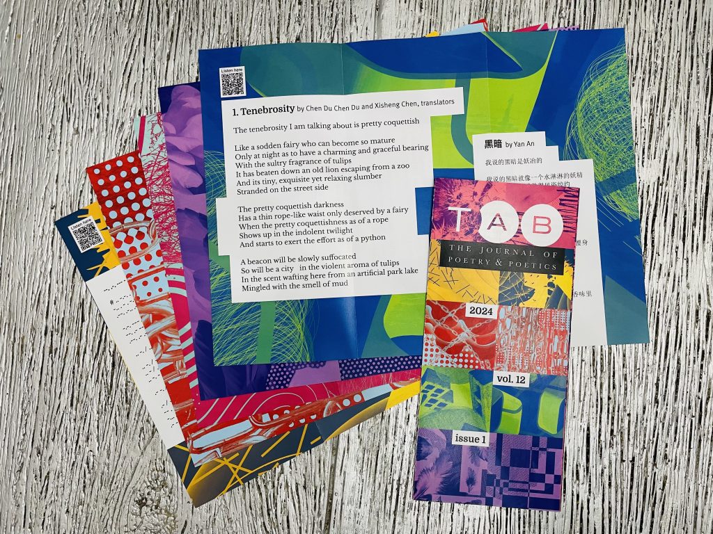
The 2024 print issue plays with concepts of collaboration. For the first time in Tab Journal’s twelve years, the Creative Director has paired with another designer, Jessica Oddi, to create the visual language of this print issue. The bold visual backgrounds demonstrate a painterly process of two artists in the same space mark-making on one canvas together.
These visual elements become front and back partners of each poster–sheet–page. The conversations between this design and the poems themselves (text and voice) amplify the definition that this printed issue is at once a singular object and two interdependent parts, like a door hinge or a pair of pliers. One component cannot operate without the other. Pairs are categorized as twos or duos of parts, people, or ideas, but pairing carries the complexity of layers. The pairing of wine and cheese embodies two objects with their own distinct processes, standards for quality, time for aging, textures, and experience of taste. In medicine, theragnostic refers to the pairing of diagnostic biomarkers with therapeutic agents to provide treatment matched to an individual. In a kinematic pair, each of two physical objects imposes constraints on the movement of the other. Pairing risks the mismatch, invites the unintended connection, and suggests what is left out by quantitive limits. The goal for this issue is partnership, conversation, and celebration of the depth and complications of useful pairings.
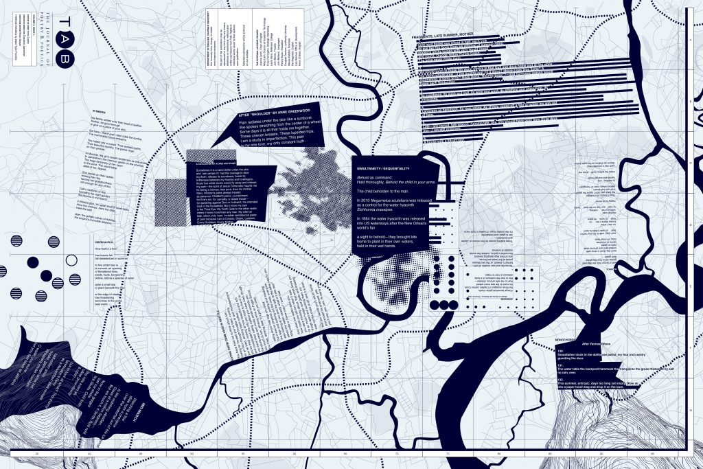
Vol. 13 (2025)

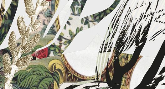
The 2025 print issue explores concepts of trickster, chance, and shifting expectations. The trickster appears in the folklore of many cultures and is one of the oldest expressions of growing civilizations. The trickster embodies wit and deceit, taking advantage of expectation and chance, building meaning only to unravel it. To “describe the trickster is to say simply that the boundary is where he will be found—sometimes drawing the line, sometimes crossing it, sometimes erasing or moving it, but always there,” writes Lewis Hyde in Trickster Makes This World. Poetry, too, invites convention and surprise as it creates lines, crosses lines, erases, and moves.
The design of this issue of Tab Journal echoes this duality, complementarity, and contradiction with contrast between striking color and stark black and white as well as the layered scapes that alter reality into warped realms that redefine portals, trap doors, and concealed dead ends and loops. Typography and alignment shift playfully between order, disorder, and reorder to mirror the trickster’s sleight of hand in the process of reading the poem. The format revisits the large sheet of earlier print issues, folded to create the expectation of order but ultimately revealing deconstructed panels and variations of skew.